Saturday 12 April 2014


Friday 11 April 2014
Evaluation - In what ways does your media product use, develop or challenge forms and conventions of real media products?
Music video:
The first
shot of my music video includes a title clip. This is seen in lots of Indie
folk videos such as in Noah and the Whale – Five Years Time. It gives the video
a film like feel which highlights the video is in a narrative style opposed to one
with performance or abstract qualities. It gives the video structure and lets
the audience know what they are about to see.


^ a picture of me using the title tool to create my personal information at the beginning of the video.
I tried out
different fonts and styles until I was happy. I chose the Orator SDT font in
the colour white. Firstly because the simplistic style is conventional of the
indie folk genre and white connotes purity and the protagonistic qualities that
I wanted my ‘artist’ to have. And also because I wanted to choose an easy style
that would look good on both my video and my ancillary texts.

Century Gothic

Comic Sans

MV Boli
 Orator STD
 Segoe Script

Tempus Sans ITC

Vrinda
The main location for my video was a woodland area. Outside locations are conventional of indie videos, especially indie folk, as the open space often resembles the emotions the artist is trying to convey to the audience. It also reinforces an idea of nature and simplicity which is what indie folk is all about. This is also shown through the use of water, hence my bathroom scene. The flowing of the water also resembles nature and emotion but likewise connotes innocence and purity which relate to the lyrics in many indie folk songs.
A lot of my video is taken up by slow motion shots and the occasional fast shot which reflects the pace and beat of the song. Editing to the beat is conventional of all genres but slow motion itself is seen a lot in the indie genres to highlight certain feelings or reactions in the narrative to convey them to the viewer. For example, the first extreme close up shot on Lily’s eye is slowed right down so you can see that she is crying and therefore reinforcing the feelings of despair and loneliness from the lyrics and the video to the viewer.

Rhythmic cutting was used throughout, getting faster as the song does to build suspense in the lyrics and the narrative. One point where the cutting was difficult was the stairs scene. In this scene I had very short shots on every little beat which showed the pace of the song was increasing. This was done by taking the long shots already used and cutting them then placing them over one long continuous shot. The repetition of the shots and how they were disordered shows the characters frenzied emotions and the unpredictability of the genre.

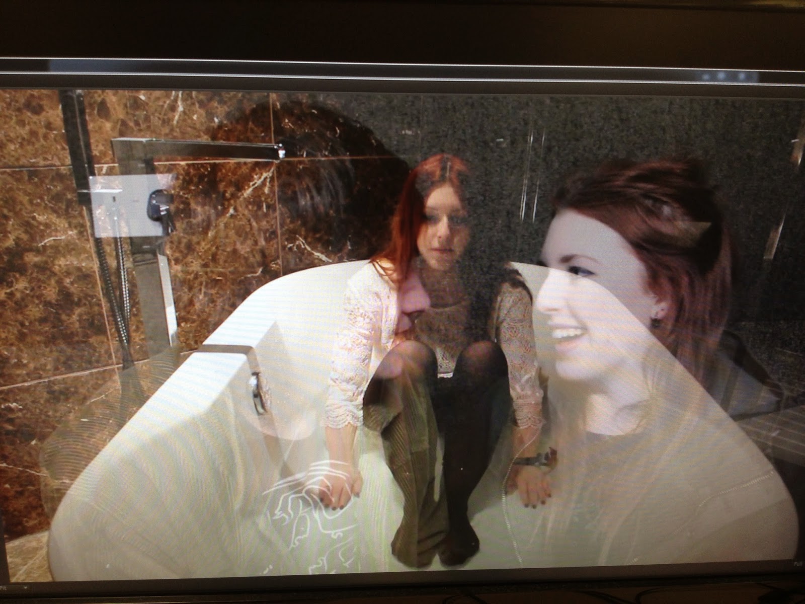
Another technique that was used a lot in my video was ghosting and placing shots on top of each other. The ghosting gave the video a blurry, time lagged effect which made the video look disorientated but in a good way. It reflected the character’s emotions and made the narrative easier to understand. I placed some shots on top of each other and changed the opacity. For example where Lily is in the bath and a previous shot of her and Wes is laid across the top. This makes it clear what the character is thinking. Both techniques look very arty, somewhat ‘trippy’, intangible and different to mainstream videos which will appeal to the indie audience.


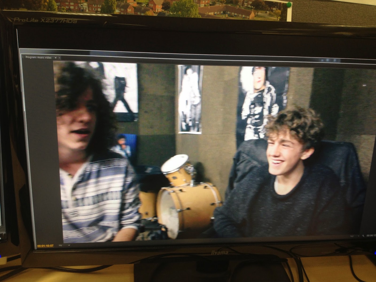
The narrative for my video was very conventional of the Indie Folk genre. Firstly, it strays from Todorov's narrative theory of equilibrium, where the protagonist will start happy, find disruption, recognise it, repair it and find a new equilibrium. In Indie Folk videos such as Ben Howard's 'Keep Your Head Up' and Frank Turner's 'The Way I Tend To Be'; both main characters start in a state of disequilibrium, or on an emotional journey of which the video captures the progress. Similarly, In my video, the heart break and loneliness is seen first, followed by her journey of recovery. This is why Indie Folk videos are perceived as being emotional and thought provoking and I think by doing this, my video looked more realistic and fit well with the lyrical analysis. Secondly, my video was in linear time. This conventional and simple style of narrative is most popular in the music video form and especially in my genre. This is because you can clearly tell a story and it is easier to see how the plot unfolds. For my video I used continuity editing to make the narrative clear to the audience. However I did use flash back scenes, like the band room scene for example. To make it obvious they were memories, I changed the colour in the video to have a bluey green which looked quite retro. Retro effects are conventional of the indie genre because the indie group in society is one of the most post-modern sub-cultures today due to their love of nostalgia and everything old or vintage. The use of flashback scenes are conventional of indie-folk videos as most the songs and videos like to show a journey or emotional progression throughout times in our lives. A flashback scene helps create this by showing the characters with contrasting emotions to what they have in the ‘present’ in the video.

The costumes for my characters, I believe are very conventional of the indie folk genre. Wes was wearing a dark band t-shirt with black skinny jeans and Doc Marten shoes. His hair was bushy and un-kept. This coincides with the male indie look that suggests they don’t care about looking smart, they are going against the clean cut conventions in society. The band T-shirt shows the ‘indie’ love of band music and the Docs show the same rebellious attitude as the Rockers and the Punks (two different and historical sub groups in society but all shared the need to rebel. The use of Doc Martens shows the rest of society that this is the view that individual has). Lily’s outfit was a white, lace dress with Chelsea heeled boots, wavy but natural looking hair and natural simplistic make up. The dress connotes innocence and purity while the hair and makeup suggest natural beauty and simplicity, similar to the simplistic acoustic tones of indie folk music.
Wes' dark clothes and Lily's clothes each have different connotations and act as a binary opposite for each other. This makes it easier for the audience to understand the different characters within the narrative and coincides with Propp's character types and functions. For example, Wes' character would be the villan (who fights the hero and usually loses, also known as the antagonist) and Lily's character is the hero (who departs on a search or journey and comes back victorious). The use of Binary Oposites through the use of mise en scene (specifically black and white costumes) can also be seen in Daughter's Video for her other single 'Still'.


![]()


Ancillaries:
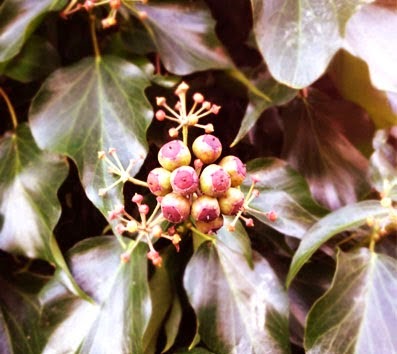
The back cover includes an image, track list and appropriate features like a barcode, rights and regulations and the record label logo. These features make the product look more realistic and professional. The text used when typing the rights and regulations is different to the text specifically for the album to show it is formal. The text on the track list is the same font and colour as the text on the front cover to show continuity. The image is a picture of leaves in a tree to keep with the nature convention of indie folk. It also reflects where the video was shot so the audience can make links between the two.

The inside covers and disks are just close up images of trees and nature to reinforce the nature aspects of the indie folk genre. All images are edited to either have a sepia tint or a purple one which make the images look worn and old. The second disk is the same as the first but inverted so that you can easily differentiate between the two but they look similar enough to be recognisable as part of the same digipak.

For my poster, I used the same layout and picture as in my album cover. This creates strong continuity and allows the audience to easily like the products. And would make the album easily recognisable after seeing the poster. I have also included extra text and information on the release date and the option to pre-order and download which is now readily available. I then included a star rating and quotes to help sell the product. This is very conventional of the indie genre, the star ratings resemble film posters which then likens the narrative in my video to a film, making it seem more interesting and entertaining.


Century Gothic
Comic Sans
MV Boli
Tempus Sans ITC
Vrinda
The main location for my video was a woodland area. Outside locations are conventional of indie videos, especially indie folk, as the open space often resembles the emotions the artist is trying to convey to the audience. It also reinforces an idea of nature and simplicity which is what indie folk is all about. This is also shown through the use of water, hence my bathroom scene. The flowing of the water also resembles nature and emotion but likewise connotes innocence and purity which relate to the lyrics in many indie folk songs.


A lot of my video is taken up by slow motion shots and the occasional fast shot which reflects the pace and beat of the song. Editing to the beat is conventional of all genres but slow motion itself is seen a lot in the indie genres to highlight certain feelings or reactions in the narrative to convey them to the viewer. For example, the first extreme close up shot on Lily’s eye is slowed right down so you can see that she is crying and therefore reinforcing the feelings of despair and loneliness from the lyrics and the video to the viewer.
Rhythmic cutting was used throughout, getting faster as the song does to build suspense in the lyrics and the narrative. One point where the cutting was difficult was the stairs scene. In this scene I had very short shots on every little beat which showed the pace of the song was increasing. This was done by taking the long shots already used and cutting them then placing them over one long continuous shot. The repetition of the shots and how they were disordered shows the characters frenzied emotions and the unpredictability of the genre.
Another technique that was used a lot in my video was ghosting and placing shots on top of each other. The ghosting gave the video a blurry, time lagged effect which made the video look disorientated but in a good way. It reflected the character’s emotions and made the narrative easier to understand. I placed some shots on top of each other and changed the opacity. For example where Lily is in the bath and a previous shot of her and Wes is laid across the top. This makes it clear what the character is thinking. Both techniques look very arty, somewhat ‘trippy’, intangible and different to mainstream videos which will appeal to the indie audience.
The narrative for my video was very conventional of the Indie Folk genre. Firstly, it strays from Todorov's narrative theory of equilibrium, where the protagonist will start happy, find disruption, recognise it, repair it and find a new equilibrium. In Indie Folk videos such as Ben Howard's 'Keep Your Head Up' and Frank Turner's 'The Way I Tend To Be'; both main characters start in a state of disequilibrium, or on an emotional journey of which the video captures the progress. Similarly, In my video, the heart break and loneliness is seen first, followed by her journey of recovery. This is why Indie Folk videos are perceived as being emotional and thought provoking and I think by doing this, my video looked more realistic and fit well with the lyrical analysis. Secondly, my video was in linear time. This conventional and simple style of narrative is most popular in the music video form and especially in my genre. This is because you can clearly tell a story and it is easier to see how the plot unfolds. For my video I used continuity editing to make the narrative clear to the audience. However I did use flash back scenes, like the band room scene for example. To make it obvious they were memories, I changed the colour in the video to have a bluey green which looked quite retro. Retro effects are conventional of the indie genre because the indie group in society is one of the most post-modern sub-cultures today due to their love of nostalgia and everything old or vintage. The use of flashback scenes are conventional of indie-folk videos as most the songs and videos like to show a journey or emotional progression throughout times in our lives. A flashback scene helps create this by showing the characters with contrasting emotions to what they have in the ‘present’ in the video.
The costumes for my characters, I believe are very conventional of the indie folk genre. Wes was wearing a dark band t-shirt with black skinny jeans and Doc Marten shoes. His hair was bushy and un-kept. This coincides with the male indie look that suggests they don’t care about looking smart, they are going against the clean cut conventions in society. The band T-shirt shows the ‘indie’ love of band music and the Docs show the same rebellious attitude as the Rockers and the Punks (two different and historical sub groups in society but all shared the need to rebel. The use of Doc Martens shows the rest of society that this is the view that individual has). Lily’s outfit was a white, lace dress with Chelsea heeled boots, wavy but natural looking hair and natural simplistic make up. The dress connotes innocence and purity while the hair and makeup suggest natural beauty and simplicity, similar to the simplistic acoustic tones of indie folk music.
Wes' dark clothes and Lily's clothes each have different connotations and act as a binary opposite for each other. This makes it easier for the audience to understand the different characters within the narrative and coincides with Propp's character types and functions. For example, Wes' character would be the villan (who fights the hero and usually loses, also known as the antagonist) and Lily's character is the hero (who departs on a search or journey and comes back victorious). The use of Binary Oposites through the use of mise en scene (specifically black and white costumes) can also be seen in Daughter's Video for her other single 'Still'.
Ancillaries:
My Front
cover includes a title and my main image. The text for my main image is the
same font and colour as the text in the opening and closing title in my music
video. The only difference is that my album also has the name of the artist as
well as the song (‘LILUTH’). The text is spaced out across the length of the front
cover for maximum visibility. It is also white text on a black background for
the same reason. The main image in the front cover takes up most of the space.
It is a picture of Lily which is conventional and makes the artist more
recognisable. I edited the photo in Photoshop by placing different pictures of
Lily from different angles over each other and changed the opacity to give the
image an abstract, ghostly feel that looks arty and will appeal to an indie
audience. The image is also tinted a purple/pink colour to give it a retro,
tarnished look, which again will appeal the nostalgic nature of an indie
audience.


I used Warpaint as inspiration
The back cover includes an image, track list and appropriate features like a barcode, rights and regulations and the record label logo. These features make the product look more realistic and professional. The text used when typing the rights and regulations is different to the text specifically for the album to show it is formal. The text on the track list is the same font and colour as the text on the front cover to show continuity. The image is a picture of leaves in a tree to keep with the nature convention of indie folk. It also reflects where the video was shot so the audience can make links between the two.
The inside covers and disks are just close up images of trees and nature to reinforce the nature aspects of the indie folk genre. All images are edited to either have a sepia tint or a purple one which make the images look worn and old. The second disk is the same as the first but inverted so that you can easily differentiate between the two but they look similar enough to be recognisable as part of the same digipak.
For my poster, I used the same layout and picture as in my album cover. This creates strong continuity and allows the audience to easily like the products. And would make the album easily recognisable after seeing the poster. I have also included extra text and information on the release date and the option to pre-order and download which is now readily available. I then included a star rating and quotes to help sell the product. This is very conventional of the indie genre, the star ratings resemble film posters which then likens the narrative in my video to a film, making it seem more interesting and entertaining.
Thursday 10 April 2014
Evaluation - How did you use audience feedback?
My audience feedback gave me a great insight into what I have done well on and what I could improve over the course of making my music video and ancillary texts.
Focus Group:
In the video bellow, I asked four people (two male, two female and all in the age bracket for my target audience between 15-30) the following questions:
- Did you enjoy my music video? And what parts the most?
- Do you think it represented the Indie-Folk genre well and why?
- Did you like the narrative? Or how could I have made it better?
- What could be improved overall?
Good Points:
The most liked scenes were the woodland, bathroom and stair scenes. People said that my video was 'well made' and included 'creative editing'. The narrative was thought to be conventional of indie folk as it resembled a 'journey' and people found it was easy to relate to the song. Many two shots and cross cutting was used in the editing which is conventional of the genre. My narrative was said to be realistic as 'reality is presented like that' and it 'represented what we go through' hopefully, making it more relatable to the audience. overall it was said to be 'technically well made'.
Improvements:
The video could have been more abstract to fit even better with the indie genre and what the indie audience likes. Some thought the narrative was made more clear through the use of the lyrics instead of being clear through the video and some parts were quite cliche. Some of the scenes should have been re-shot (Lily and Wes fighting) because they were visibly laughing in some parts. Lastly, the lighting could have been improved on the woodland scene. The darkness makes it difficult to see her expressions.
How I used the audience feedback:
For the point about making the woodland scene lighter, I used post filming editing techniques since I didn't have time to re-film. This included changing the light balance, brightness and contrast of this scene whilst using the editing suites. Although it is not as effective as re-filming and using proper lighting equipment on set, It did improve the quality of the scene and made it look more professional. In order to make the narrative more clear for the audience, I cut out some shots that were on the original story board and changed them to scenes that I thought were more fitting. For example, Lily and Wes' fight scene. This scene, I believe makes it clearer to the audience that the video portrays a break up instead of focusing on Lily in the woods (post-break up). The use of an actual fight scene is more conventional and helps the audience understand the rest of the video.
Questionnaire:
By doing a questionnaire I have been able to get feedback from a large number of people quickly. the benefit of asking many people is that the feedback will be different and each one will have something else to improve, maximising the amount of improvements I could make.
here are some examples of the replies from the 20 questionnaires I handed out:


Ancillary feedback by chlo.dunn on GoAnimate

Focus Group:
In the video bellow, I asked four people (two male, two female and all in the age bracket for my target audience between 15-30) the following questions:
- Did you enjoy my music video? And what parts the most?
- Do you think it represented the Indie-Folk genre well and why?
- Did you like the narrative? Or how could I have made it better?
- What could be improved overall?
Good Points:
The most liked scenes were the woodland, bathroom and stair scenes. People said that my video was 'well made' and included 'creative editing'. The narrative was thought to be conventional of indie folk as it resembled a 'journey' and people found it was easy to relate to the song. Many two shots and cross cutting was used in the editing which is conventional of the genre. My narrative was said to be realistic as 'reality is presented like that' and it 'represented what we go through' hopefully, making it more relatable to the audience. overall it was said to be 'technically well made'.
Improvements:
The video could have been more abstract to fit even better with the indie genre and what the indie audience likes. Some thought the narrative was made more clear through the use of the lyrics instead of being clear through the video and some parts were quite cliche. Some of the scenes should have been re-shot (Lily and Wes fighting) because they were visibly laughing in some parts. Lastly, the lighting could have been improved on the woodland scene. The darkness makes it difficult to see her expressions.
How I used the audience feedback:
For the point about making the woodland scene lighter, I used post filming editing techniques since I didn't have time to re-film. This included changing the light balance, brightness and contrast of this scene whilst using the editing suites. Although it is not as effective as re-filming and using proper lighting equipment on set, It did improve the quality of the scene and made it look more professional. In order to make the narrative more clear for the audience, I cut out some shots that were on the original story board and changed them to scenes that I thought were more fitting. For example, Lily and Wes' fight scene. This scene, I believe makes it clearer to the audience that the video portrays a break up instead of focusing on Lily in the woods (post-break up). The use of an actual fight scene is more conventional and helps the audience understand the rest of the video.
Questionnaire:
By doing a questionnaire I have been able to get feedback from a large number of people quickly. the benefit of asking many people is that the feedback will be different and each one will have something else to improve, maximising the amount of improvements I could make.
here are some examples of the replies from the 20 questionnaires I handed out:
Audience feedback has given me a great opportunity to improve my products on areas that I may have missed. After continuously working on the same project for months, it is a good thing to get a fresh view from your target or niche audience to make any little corrections or constructive criticism in order to make your product the best it can possibly be. After listening to people's feedback, I realised that I agree with everything they have suggested, even the subtle improvements like adding some more effects on the stairs scene and improving the lighting on the woodland scene. All of these are reasonable suggestions that I wouldn't have thought about without some feedback and a fresh point of view.
Ancillary text feedback:
Good points:
Many said that the digipak and poster linked very well with my main product and there was clear similarities which would make them recognise the digipak in a music store. Every one loved the image of Lily and how I changed the opacity of her face and placed different angles of her face on top. Some said this made the ancillaries 'arty' looking which fits well with the genre and would appeal to the indie audience. Others liked the text, they said it 'stood out well' and the simplistic style makes the product professional and classy looking. Another good point was the use of features on the back like barcodes, record label logos and small print, these all made my digipak look like a real media product. The favourite feature in the poster was the star rating, this apparently made it look a lot more realistic.
Improvements:
The main improvement most people said was that the poster looked quite simple and it would look better if the text was edited a bit more and made larger. Someone also said that the digipak may have looked better if some of the images were taken from my actual video (like the bath scene) this would link the products more for maximum continuity. Finally, someone mentioned that more colours should be used in my ancillary texts to make the product stand out more instead of the dark colours I have used. Specifically in the poster where the majority of it is black.
I also used Web 2.0 to gain audience feedback as it is a common media platform that is highly used and easily accessible. In this case I used Twitter. Other social networking sites like Facebook and Instagram can also be used to achieve the same results. Even YouTube has a space to leave your comments. This is specifically good for gaining feedback from people outside your peer group and of different demographics. When asking my friends what they thought, this was the results:
The comments about the narrative and creativity was reassuring, and shows that I have taken into consideration feed back given on previous drafts.
Evaluation - How effective is the combination of your main product and ancillary texts?
My ancillary texts and music
video was made with the same themes and styles, matching the indie genre. For
example, the colour scheme. In my digipak, video and poster I have given the
images a purple/sepia tint to give the products an old, tarnished feel that is
conventional of the genre. It is a conventional aspect of Indie Folk as the Indie genre is associated with nostalgia (hence the Doc Martens in the Mise en scene, the love and respect of everything old or vintage).


I have used the exact same image
of the digipak in the poster to create a strong link between the two ancillary
texts. These both link to my video because the images from this shoot were
taken whilst shooting the footage for the woodland scene. This meant that the
pictures were pretty much taken from the video itself, with Lily being in the
same location, wearing the same costume and the exact same hair and makeup, as
well other contributing factors like weather and sunlight which can change the
quality of the image. This makes the ancillary products highly recognisable if
you had already seen the video and vice versa.


I have used the same text, font and colour in all of my products. The title (‘YOUTH’) in my music video and titles (‘LILUTH’ and ‘YOUTH’) in my ancillary texts are both in the Orator STD font and are coloured white. The use of colour and font not only complies with the conventions of the genre (here meaning the use of pure, neutral colours that resemble nature and simplicity.) but creates a clear link between my products.


The same image from my poster and digipak, using Photoshop, has been used in other forms of advertising like in social media (Facebook, Spotify, Vevo etc.) and in physical advertisement like bus stops and magazines. This shows a continuity in my advertisement so the audience will instantly recognise my product.
These artists below are where I
got my inspiration for using my album cover in my poster.


Monday 7 April 2014
Music Video Second Draft
There is an error with my candidate number. My actual candidate number is 4199.
Subscribe to:
Posts (Atom)